Figure 3
From: CellProfiler Analyst: data exploration and analysis software for complex image-based screens

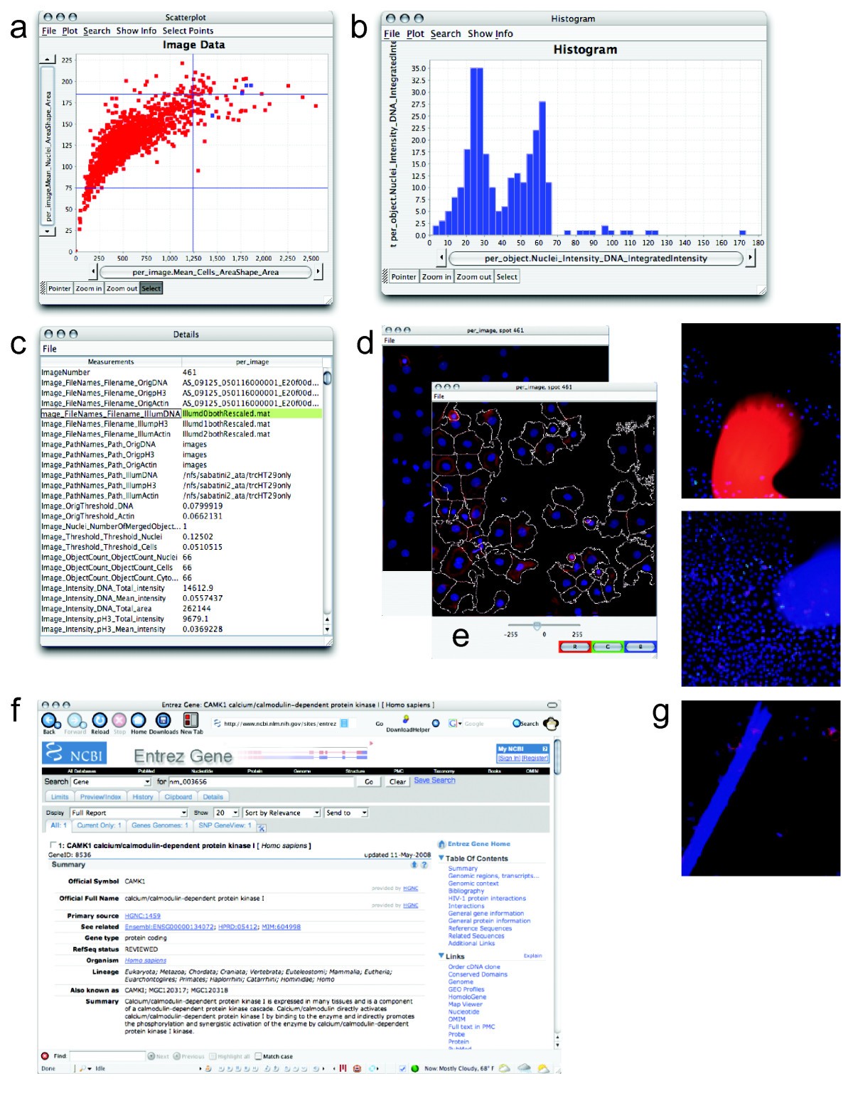
Data points can be investigated. The data points highlighted in blue in the scatterplot (a) represent replicates of a particular treatment condition with high mean cell area and nuclear area. To examine the cell cycle distribution of these samples, a DNA content histogram based on individual cells within those four images was plotted (b). For one of the four data points, the researcher displayed a table of all measurements in the database (c), the raw image (d), or with outlines overlaid (e). Each staining/channel (red, green, blue) can be toggled on or off to allow close examination of the relationships between them. Information from a public website describing the gene tested in one of the samples has been displayed (f) by clicking the data point. Outlier data points for certain measured features (e.g., high mean cell actin intensity, high mean cell area, high segmentation threshold, or percent of pixels that are saturated) can indicate images with severe artifacts (g) that should be excluded from analysis. These images can be identified by their aberrant measurements and excluded from further analysis by gating (i.e., selecting only a subset of data to be plotted and analyzed further).